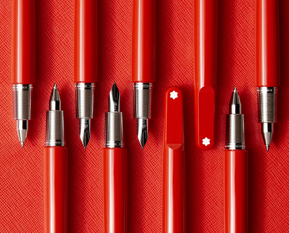
Luxury, but a little loosey-goosey.
The notion that luxury must speak in refined tones, although widely believed, is flawed. And frankly, it doesn’t take a rocket scientist to know that no amount of high-nosed content will convince a 28-year-old to spend their hard-earned money on a Montblanc. Fortunately, the team agreed that the brand should loosen its collar and play with the old codes of luxury.
Over the eighteen months I worked on Montblanc,
I was often tasked with creating content formats that could live between product launches and campaign assets. In other words, something that would interrupt a feed heavily geared towards polished lifestyle imagery.
Naturally, as a copywriter, I went visual.
CONTENT SERIES
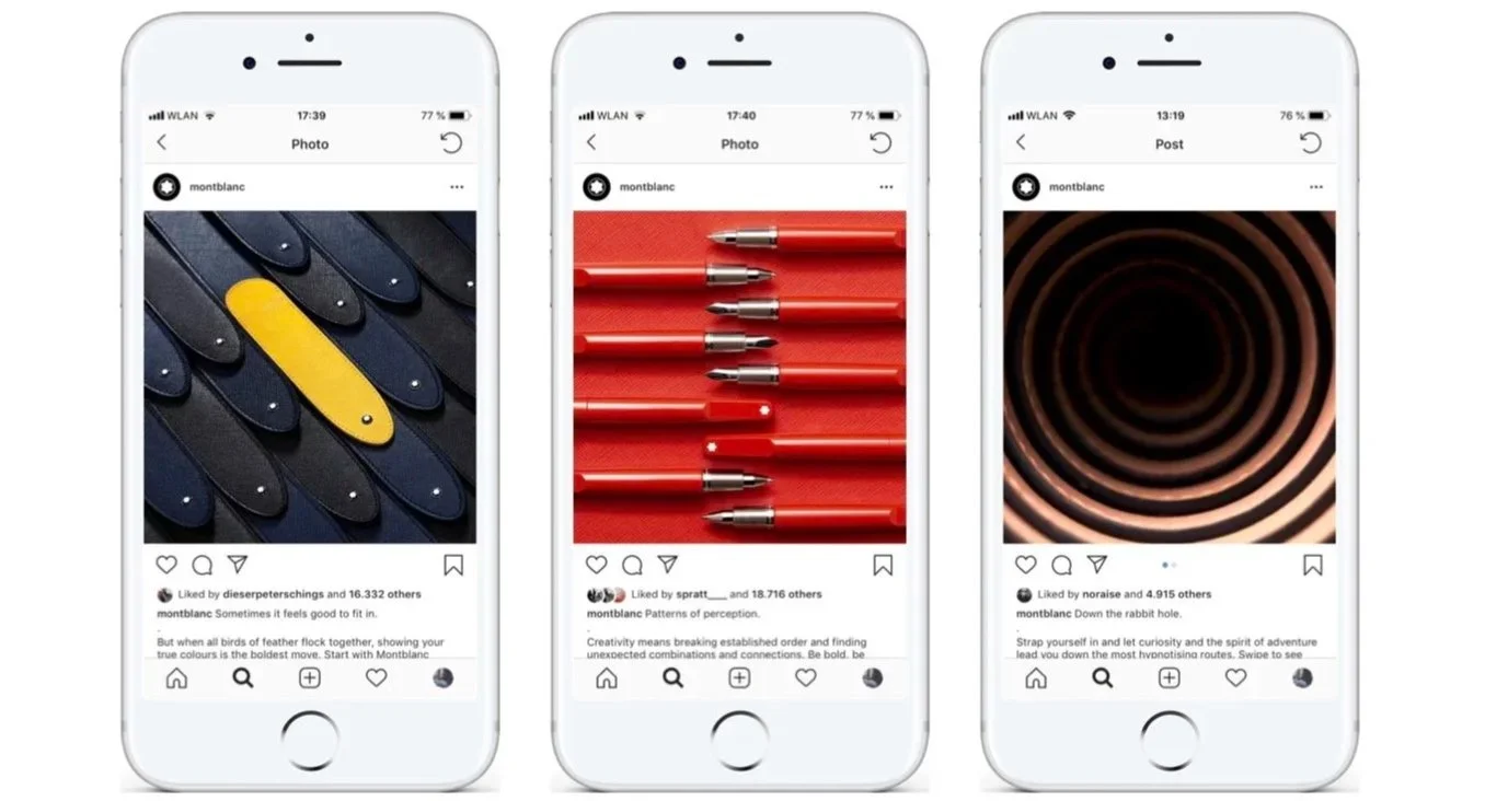
Series 01:
Believe it or not, getting the concept approved was the easy part. The real challenge came when we had to request the products to bring it to life. Suddenly, we needed twenty writing instruments instead of one. Along with 40 pen sleeves, about a dozen belts, etc.
A perfectly reasonable request, if you ask me.
The series broke engagement records at the time and was considered one of the most successful on the channel.
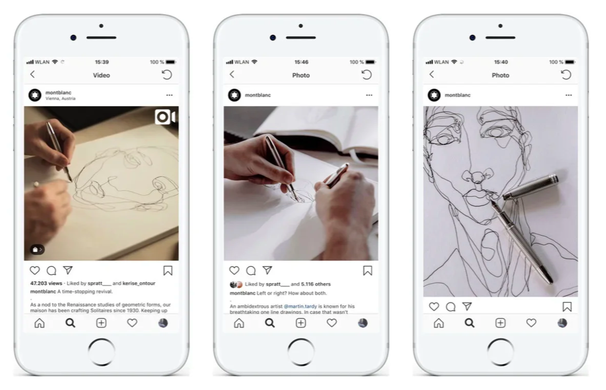
Series 02:
What’s better than one Montblanc? Two, you silly goose.
Montblanc may be best known for its writing instruments, but we wanted to see what happened when they became drawing instruments instead. So we teamed up with Martin Tardy, an exceptional illustrator with the rather unfair ability to draw with both hands at once.
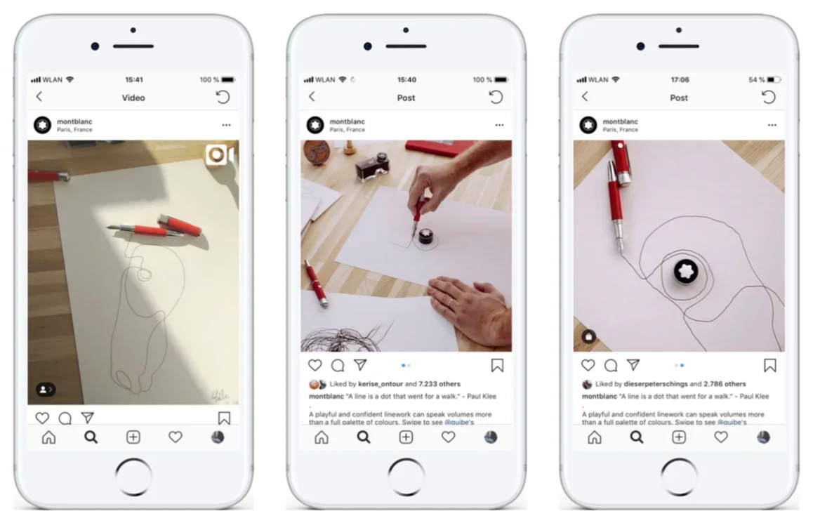
Series 03:
Next came Quibe. An incredible artist, who didn’t just see a writing instrument but a horse’s ears. He also turned an ink pot into an eye. And many more.
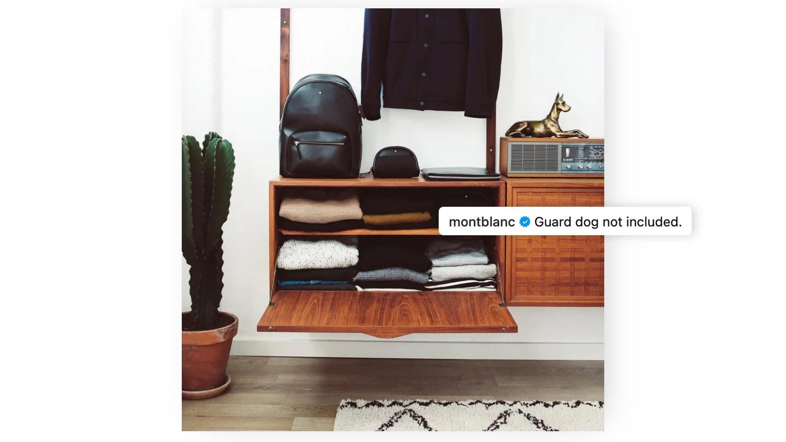
Caption this
As part of daily business, I helped out with caption writing.
It was an interesting system. We received images with zero context and had to simply wing it.
Here’s a small sample. And allow me to say, ChatGPT could never.
Agency: TLGG. Role: Concept + Copy.
Nobody gets anywhere alone. Credits to everyone involved.